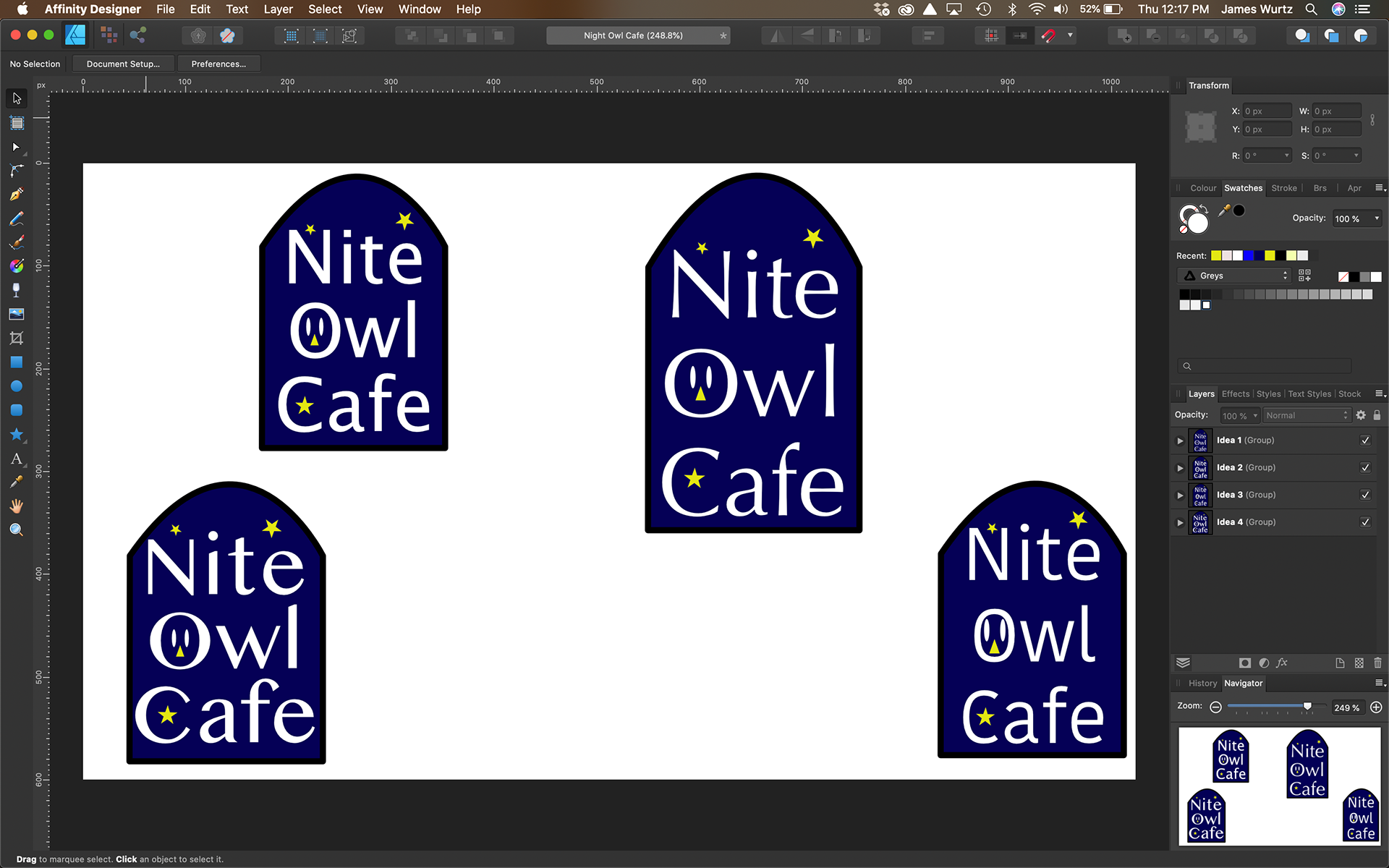
Various concepts before the final logo was decided upon
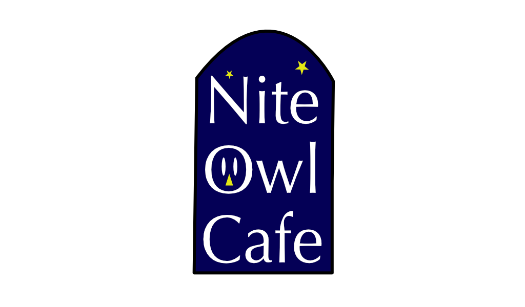
I was recommended to try out a website known as the Sharpen Design Challenge to hone my skills & create something that spoke to me personally. After numerous refreshes, I came across a prompt that dealt with creating a title slide for a cafe in Seattle. I took that and edited it to become a logo concept. I had cleared through a game known as Coffee Talk and the premise very much inspired this logo. Called "Nite Owl Cafe" this coffeeshop has a unique specialty in opening only during the night. I used a black border with a dark blue background. Small stars decorate the top alongside an owl face. The face is nestled within the "O". Optima is the font chosen that I felt best represented both the name and type of business.
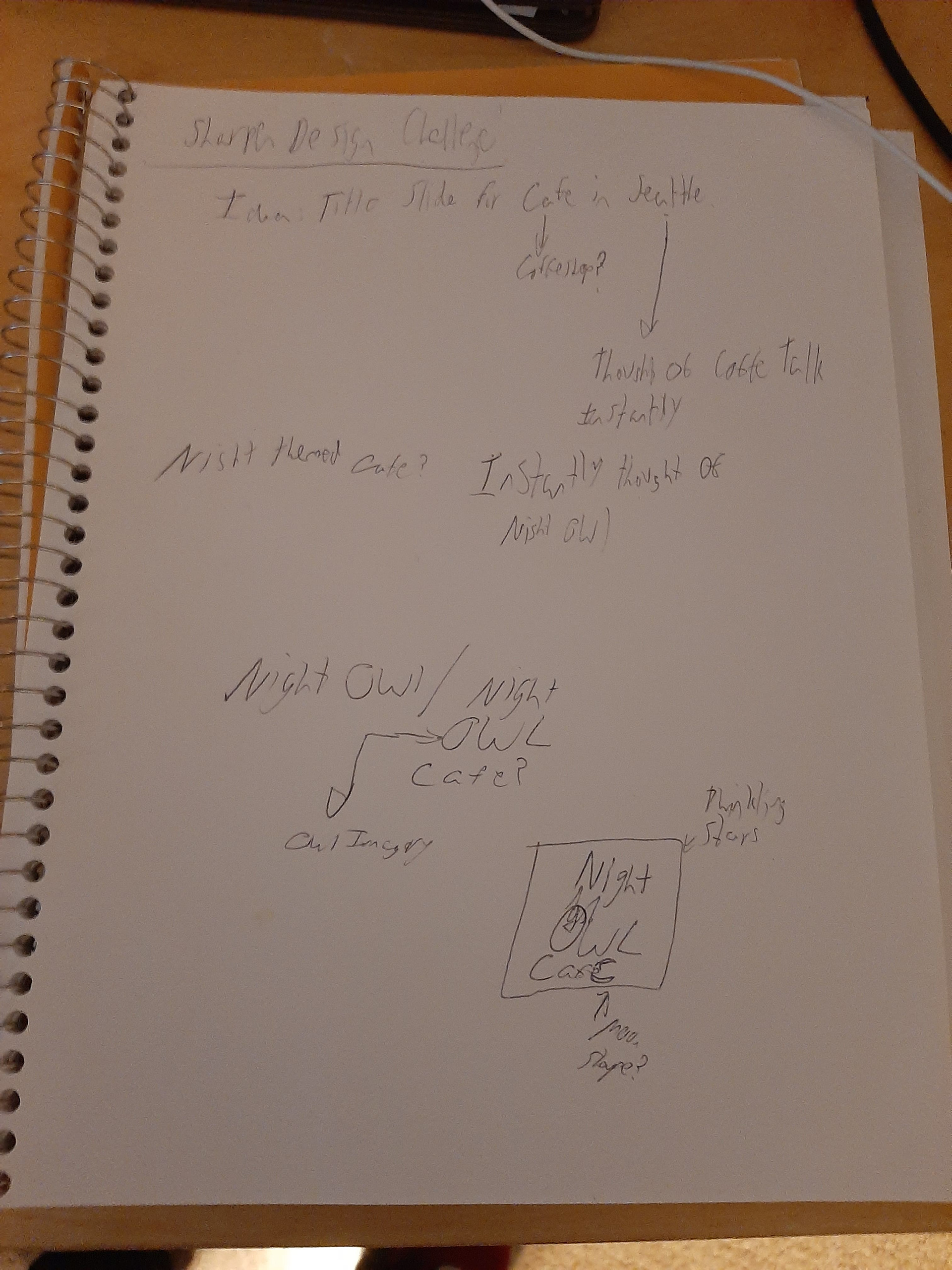
Preliminary Sketches
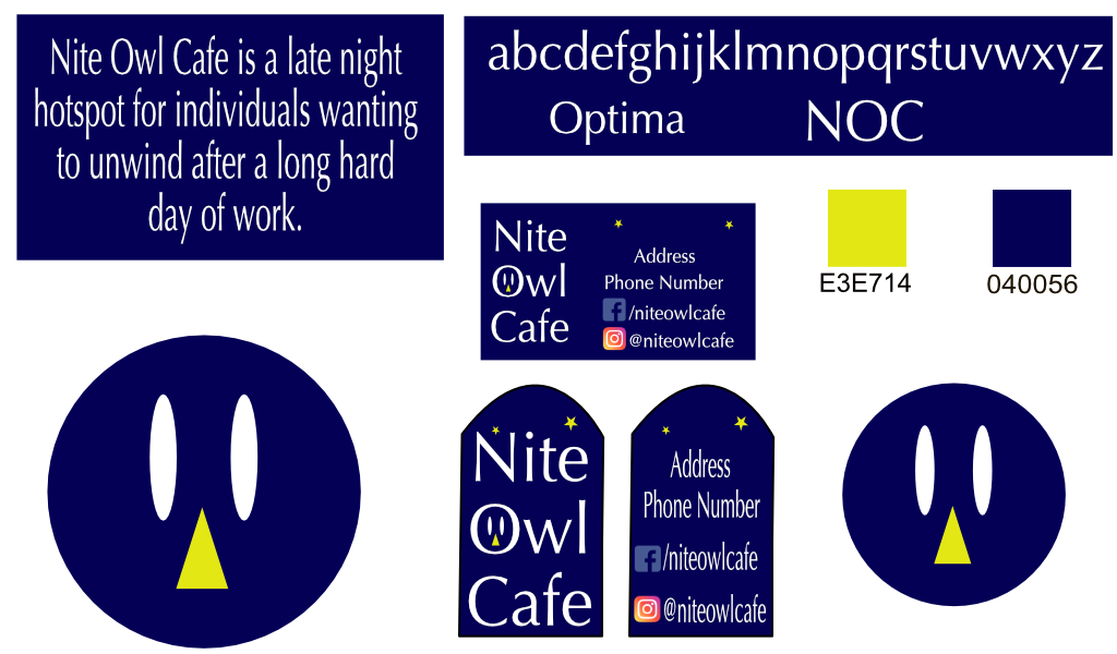
Branding Sheet
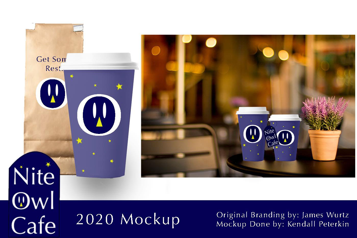
Mockup done by Kendall Peterkin
This project was also a way for me to explore the Affinity Designer software I started using around the same time! A fellow designer friend of mine created a mockup of coffee cups and delivery bags for the Nite Owl Cafe. Having the owl face be front and center on the cup and bag was a smart choice! I also created a branding guide/style sheet for the cafe. Here, I 've included variations of a Business Card, the main colors in the logo plus a look at the font choice. In addition, I came up with what I felt would be a solid Mission Statement for Nite Owl Cafe.
Programs Used: Affinity Designer